
Create OS-style backgrounds with backdrop-filter
Blurring and color shifting behind an element.


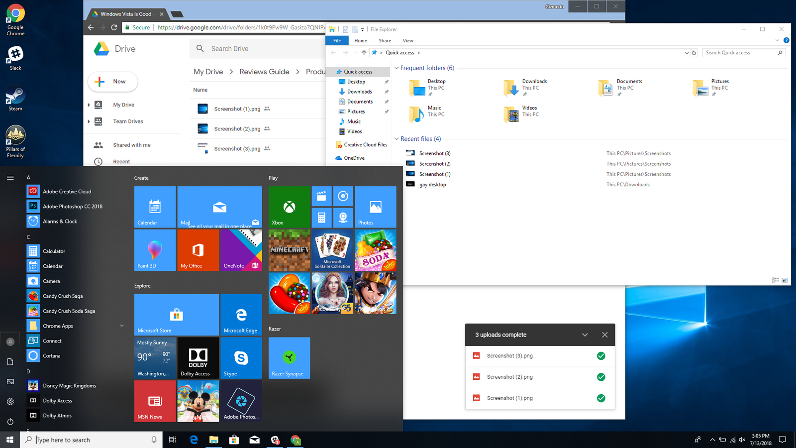
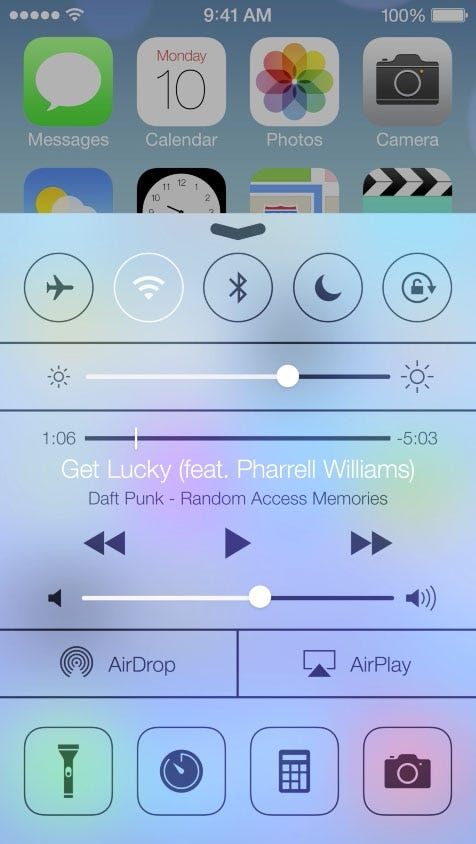
Translucence, blurring, and other effects are useful ways of creating depth while keeping the context of the background content. They support a host of use cases such as frosted glass, video overlays, translucent navigation headers, inappropriate image censoring, image loading, and so on. You may recognize these effects from two popular operating systems: Windows 10 and iOS.

Historically, these techniques were difficult to implement on the web, requiring less than perfect hacks or workarounds. In recent years both Safari and Edge have provided these capabilities through the background-filter (and alternatively, the -webkit-backdrop-filter) property, which dynamically blends foreground and background colors based on filter functions. Now Chrome supports background-filter, starting in version 76.
backdrop-filter. Try the example on CodePen.
Browser support #
- Chrome 76, Supported 76
- Firefox 103, Supported 103
- Edge 17, Supported 17
- Safari 9, Supported 9
For performance reasons, fall back to an image instead of a polyfill when backdrop-filter isn't supported. The example below shows this.
@supports (backdrop-filter: none) {
.background {
backdrop-filter: blur(10px);
}
}
@supports not (backdrop-filter: none) {
.background {
background-image: blurred-hero.png;
}
}
## Basics
- The `backdrop-filter` property applies one or more filters to an element, changing the appearance of anything behind the element.
- The overlaying element must be at least partially transparent.
- The overlaying element will get a new stacking context.
<aside class="aside flow bg-state-bad-bg color-state-bad-text"><p class="cluster color-state-bad-text"><span class="aside__icon box-block "><svg width="24" height="24" viewBox="0 0 24 24" fill="currentColor" xmlns="http://www.w3.org/2000/svg" role="img" aria-label="Error sign"> <path fill-rule="evenodd" clip-rule="evenodd" d="M12 2C6.48 2 2 6.48 2 12s4.48 10 10 10 10-4.48 10-10S17.52 2 12 2zm-1 15v-2h2v2h-2zm0-10v6h2V7h-2z" /> </svg></span><strong>Caution</strong></p><div class=" flow"> <code>backdrop-filter</code> may harm performance. Test it before deploying. </div></aside>
CSS `backdrop-filter` applies one or more effects to an element that is translucent or transparent. To understand that, consider the images below.
<div class="switcher">
<figure class="compare flow" data-type="worse" data-size="full"><p class="compare__label">No foreground transparency</p>
<img alt="A triangle superimposed on a circle. The circle can't be seen through the triangle." decoding="async" height="283" loading="lazy" sizes="(min-width: 480px) 480px, calc(100vw - 48px)" src="https://web-dev.imgix.net/image/admin/LOqxvB3qqVkbZBmxMmKS.png?auto=format" srcset="https://web-dev.imgix.net/image/admin/LOqxvB3qqVkbZBmxMmKS.png?auto=format&w=200 200w, https://web-dev.imgix.net/image/admin/LOqxvB3qqVkbZBmxMmKS.png?auto=format&w=228 228w, https://web-dev.imgix.net/image/admin/LOqxvB3qqVkbZBmxMmKS.png?auto=format&w=260 260w, https://web-dev.imgix.net/image/admin/LOqxvB3qqVkbZBmxMmKS.png?auto=format&w=296 296w, https://web-dev.imgix.net/image/admin/LOqxvB3qqVkbZBmxMmKS.png?auto=format&w=338 338w, https://web-dev.imgix.net/image/admin/LOqxvB3qqVkbZBmxMmKS.png?auto=format&w=385 385w, https://web-dev.imgix.net/image/admin/LOqxvB3qqVkbZBmxMmKS.png?auto=format&w=439 439w, https://web-dev.imgix.net/image/admin/LOqxvB3qqVkbZBmxMmKS.png?auto=format&w=500 500w, https://web-dev.imgix.net/image/admin/LOqxvB3qqVkbZBmxMmKS.png?auto=format&w=571 571w, https://web-dev.imgix.net/image/admin/LOqxvB3qqVkbZBmxMmKS.png?auto=format&w=650 650w, https://web-dev.imgix.net/image/admin/LOqxvB3qqVkbZBmxMmKS.png?auto=format&w=741 741w, https://web-dev.imgix.net/image/admin/LOqxvB3qqVkbZBmxMmKS.png?auto=format&w=845 845w, https://web-dev.imgix.net/image/admin/LOqxvB3qqVkbZBmxMmKS.png?auto=format&w=960 960w" width="480" />
```css
.frosty-glass-pane {
backdrop-filter: blur(2px);
}Foreground transparency

.frosty-glass-pane {
  opacity: .9;
  backdrop-filter: blur(2px);
}